When we design an interface for a product there are two questions we should ask before doing anything else:
- How much time does the user have to comprehend the product?
- How much potential proficiency should the product offer the user?
These factors are important because they can be used to plot learning curves: experience on the x axis and proficiency on the y axis. Once we know the shape of the learning curve best suited to the user, we can design an interface that is either more intuitive (easier to learn) or more powerful (offers greater proficiency).
An interface with a logarithmic learning curve (one that levels out over time) is more intuitive. It enables the user to quickly familiarize themselves with the features of the product. Intuitive learning curves mean less time must be invested to become competent with the product, but in exchange there is a reduction in how proficient the user can become over time. Take, for example, a French press.

The interface of a French press is intutive, but not powerful (photo by Don LaVange, https://flic.kr/p/cmthoq)
The simplicity of a French press’ interface means that a user can quickly understand the mechanism of the product, how to operate it and can predict what the outcome will be. Pour water and ground coffee into the pot, wait a few minutes, push the top down, pour coffee. The learning curve for a French press looks something like this:
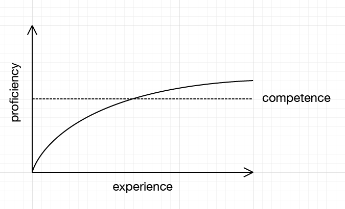
The time required to reach competence (making a decent cup of coffee) is fairly short, but the curve quickly flattens off as we reach the maximum potential of the product. There is a little more proficiency available after reaching competence, such as learning to adjust the amount of coffee used or to heat the pot first to reduce cooling time. After this the curve levels off as the user reaches mastery of the product.
An interface with an exponential learning curve (one that curves upward over time) is more powerful. A powerful interface offers the user more control over a product. It requires a greater time investment to reach competence but offers the user an increased maximum proficiency. In contrast to a French press, consider a café-grade espresso machine.

An espresso machine interface offers more power, but requires a greater initial investment of time (photo by Felipe Neves, https://flic.kr/p/aWEoia)
To an inexperienced user there’s more to process and this means an increase in the time and brainpower required to make an acceptable cup of coffee. Grind the beans into the portafilter, tamp the coffee, attach and run water through the portafilter, add hot water or milk as desired. The learning curve here would look more like this:
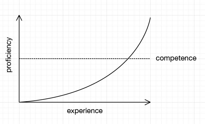
The added complexity of the interface means there is more potential for inexperienced users to fail than when operating a French press. But with practice the user will be able to pull a good espresso, and from there they can become a more skilled barista than the French press owner as they learn to make cappuccinos, flat whites and other caffeinated delights.
All user interfaces have learning curves. Manual vs. automatic transmission in cars, elevators vs. escalators, command line vs. GUI. In every case, there is a trade-off between intuitiveness and power that a designer has had to make.
This trade-off is not necessarily based around the available features of the product itself or even the complexity of the actions a proficient user might make. An interface for a complex piece of machinery might be intuitive but fail to offer an experienced user the ability to perform actions better or more effectively than a less experienced user. Take for example this interface for a cherry picker crane:
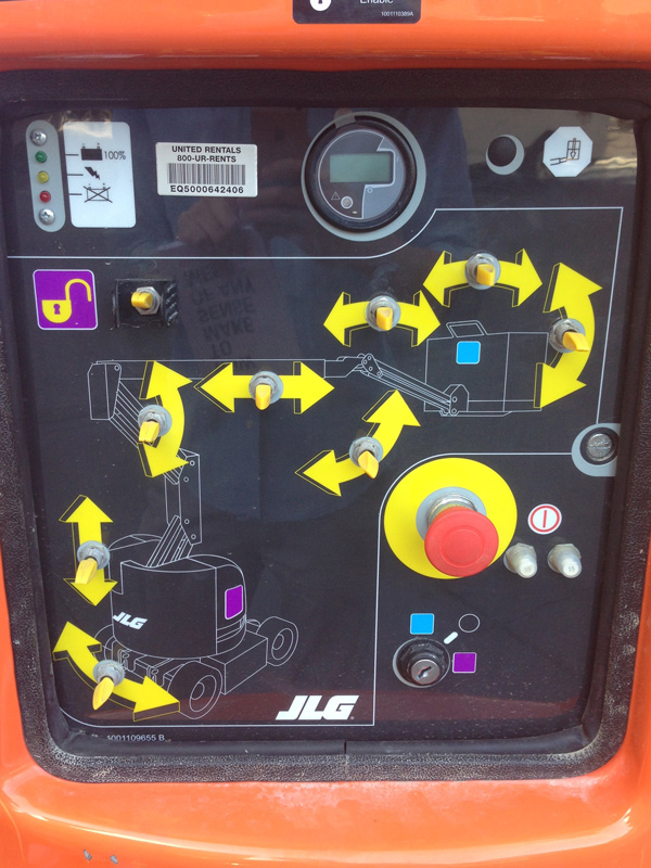
The control panel of a cherry picker crane
This crane is obviously a complex piece of machinery, but the interface does an excellent job of making clear how each switch will affect its position. However, the interface is not powerful (in the sense that we are defining it) because an experienced user must still navigate a relatively cumbersome set of switches over a large area, even once they know exactly what each one does.
But if the complexity of the product is not the deciding factor in an interface’s learning curve, what is?
The decision of whether to make an interface intuitive or powerful is most heavily influenced by the intended audience of the product. In the example above, the cherry picker will likely be hired out for a single job by a work crew who may have never used the device before. This crew may not have a long time over which to hone their skills, but more often will be learning on the job in an environment that is noisy and full of potential hazards. The designer of the crane recognized this and decided a logarithmic learning curve would be most appropriate.
We must consider the same factors when building interfaces for digital products. The intended audience may be tech-savvy and time-rich with many months available to master the product. They may relish the opportunity to learn new things and overcome challenges in exchange for expertise and proficiency. But they could also be less technically-minded, time-poor or not sufficiently sold on a product to invest lots of time in using it. They may have complex needs that require lots of time to meet, or they may have simple needs that don’t.
An obvious example of this in the digital world is the difference between mobile and desktop applications. Not only must we consider differences in device hardware such as screen size and processing power, but also the differences in the context that users will operate those devices. A mobile device user is likely to have less time available and face more distractions from the world around them, but will probably also have fewer needs. For these users, intuitiveness is more important than power. Conversely, a desktop user is likely to have more time to comprehend an interface in the comfort of their home or office and will therefore expect to achieve increasingly complex tasks as their experience with the product increases. In these cases, we can trade in some intuitiveness in the short term for added proficiency in the long term.
As with all humanistic design, it is important to put the user and their needs first and not simply to crowbar the same solutions into everything we design. Abby Covert writes in How to Make Sense of Any Mess:
“What works for kids might annoy older people. What worked five years ago may not work today. We have to think about the effects of adopting an existing structure or language before doing so.”
The cost of misjudging learning curves is frustration for the user. If an interface is intuitive but does not reward experience, the user will move on to another product that lets them be more proficient. If an interface is too hard to learn, users will simply ignore it in the first place.
Once a learning curve has been established we can more easily make decisions about a digital interface. Should we nest items in this menu so it’s easier to navigate for power users, or will new users struggle to find things? Should we add tooltips to educate new users, or will that be patronizing for existing ones?
Good interface design means recognizing what solutions are appropriate for which demographics and in which contexts. It means setting aside our assumptions and talking to users about their priorities rather than imposing ours upon them. It means watching people use a product - not just for five minutes but over the course of days, weeks and months. Being aware of learning curves and how they differ across different groups of people means we can build interfaces that make users happy. What’s more important than that?