Do you have a link on your website that looks like this?
<a href="mailto:yourname@yoursite.com">Contact</a>
If so, you are probably frustrating a lot of your users.
Mailto links instruct the operating system to open the default email client and create a new draft email with the ‘to’ field already populated. That’s fairly presumptuous behavior at the best of times, but it’s especially jarring to a user who was expecting to see a web page with, say, a contact form on it.
An improvement would be to use the word ‘email’ in the label text:
<a href="mailto:yourname@yoursite.com">Email us</a>
This is better because it creates a clearer expectation of what will happen when the user clicks the link, but it still isn’t much help to people who don’t want mailto behavior in the first place. Specifically, this is anybody who:
- Doesn’t use a native email client, for example Gmail users who use mail.google.com. (Some browsers will open mailto links using a web address, but this often requires some non-trivial tweaking deep in the application settings.)
- Uses a third-party native email client but is unable to make that their default email client, for example an iPhone user who uses anything other than Apple’s Mail app.

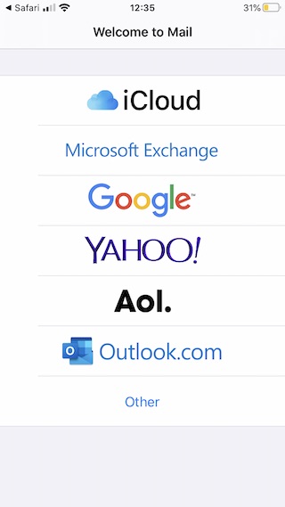
As a self-hating iPhone user who uses the Microsoft Outlook app for email, this is what I see when I tap a mailto link in my web browser. It’s not very useful.
What’s more, labeling an email address with ‘email’ is redundant. Everyone knows that yourname@yoursite.com is an email address, so why not use that as the label?
<a href="mailto:yourname@yoursite.com">yourname@yoursite.com</a>
Not only does this establish a crystal clear expectation of behavior, it also means the user can actually read the email address. Best of all, it’s easy to copy and paste the address, which is important for users who don’t want mailto behavior or want to do something else with the email address like save it to their contacts.
As a final note, I would encourage anyone who publishes content on the web to think carefully about how they label any link, not just mailto links. Many users rely on label text as their only context for where a link will take them, for example touchscreen users who can’t hover on a link to see its URL, or screen-reader users who may see a link isolated from its surrounding text (try using a screen-reader to navigate a web page full of links labelled ‘click here’ or ‘more’ and you will quickly realize how valuable meaningful link labels are). As always, less guesswork makes for a more usable website.